flex 디펜스는 flex 개구리를 이어서 flex를 연습할 수 있는 간단한 게임이다.
정답을 정리했고, 풀었을 때 조금 시간이 걸렸던 것만 부가적으로 글을 적었다.
flex 디펜스 링크: http://www.flexboxdefense.com/
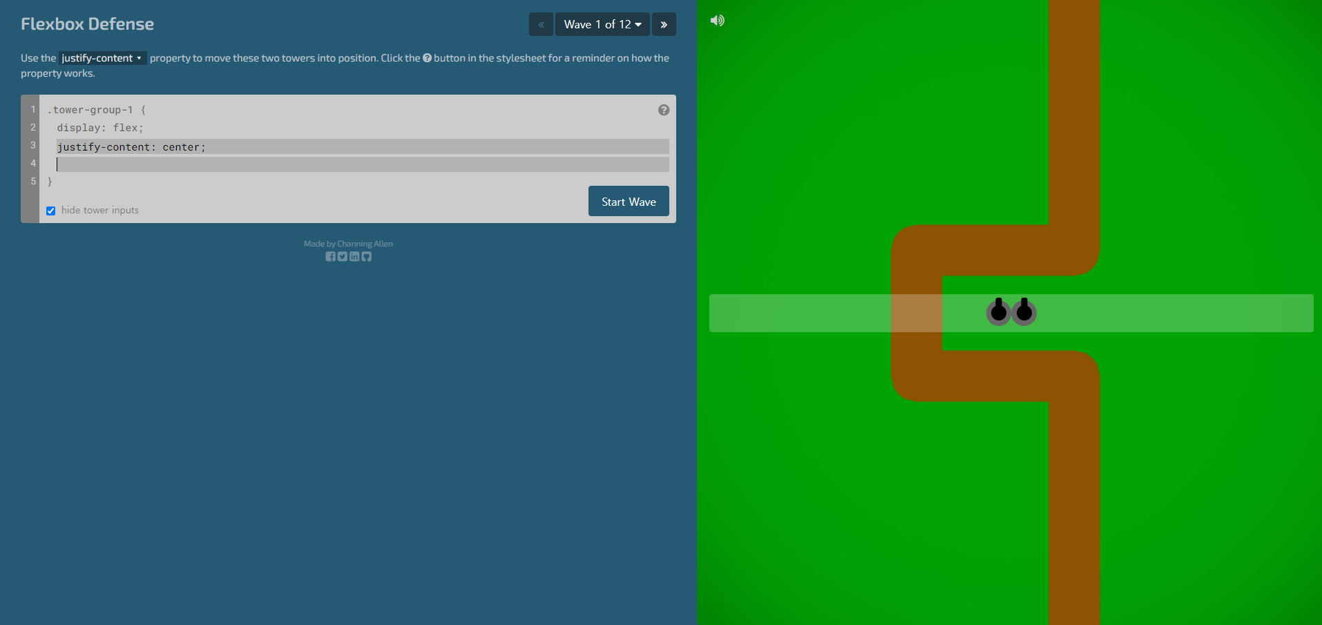
1단계
.tower-group-1 {
	display: flex;
	justify-content: center;
}
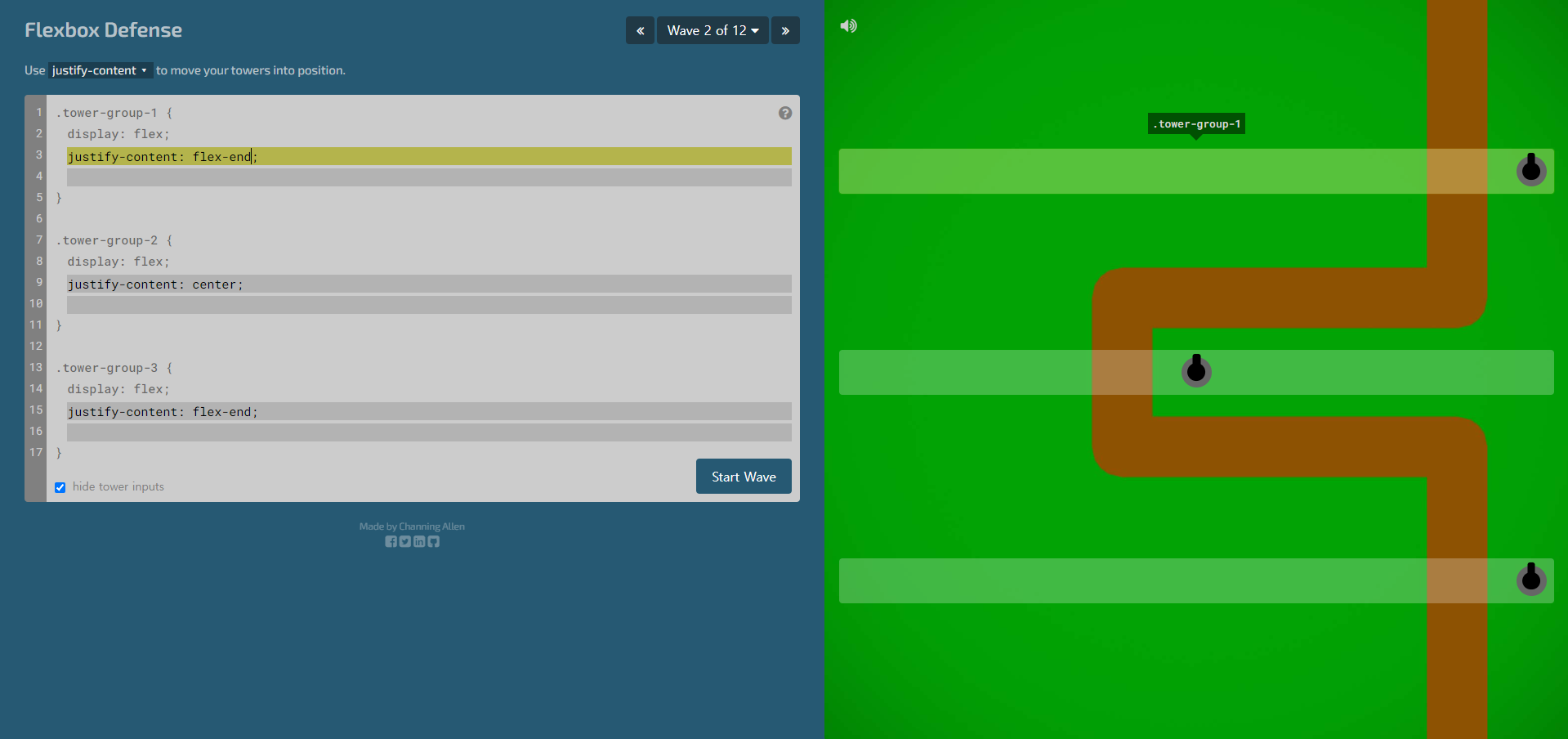
2단계
.tower-group-1 {
	display: flex;
	justify-content: flex-end;
}
.tower-group-2 {
	display: flex;
	justify-content: center;
}
.tower-group-3 {
	display: flex;
	justify-content: flex-end;
}
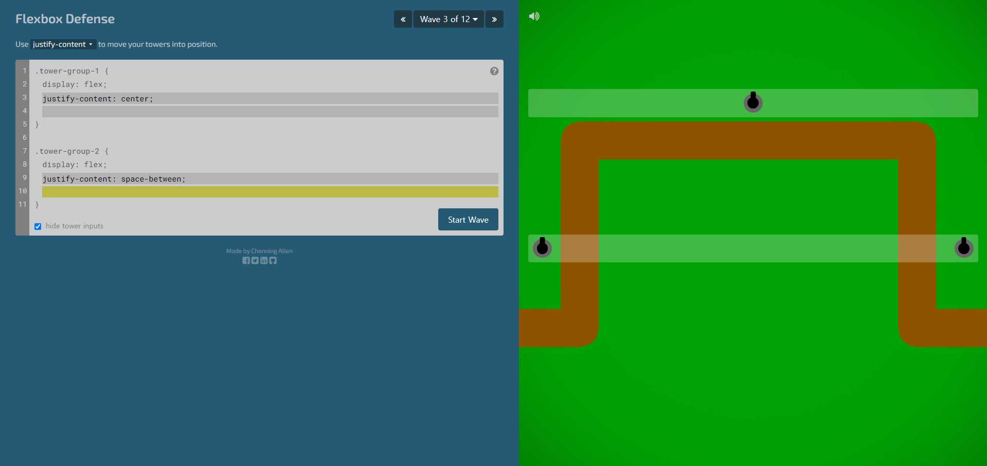
3단계
.tower-group-1 {
	display: flex;
	justify-content: center;
}
.tower-group-2 {
	display: flex;
	justify-content: space-between;
}
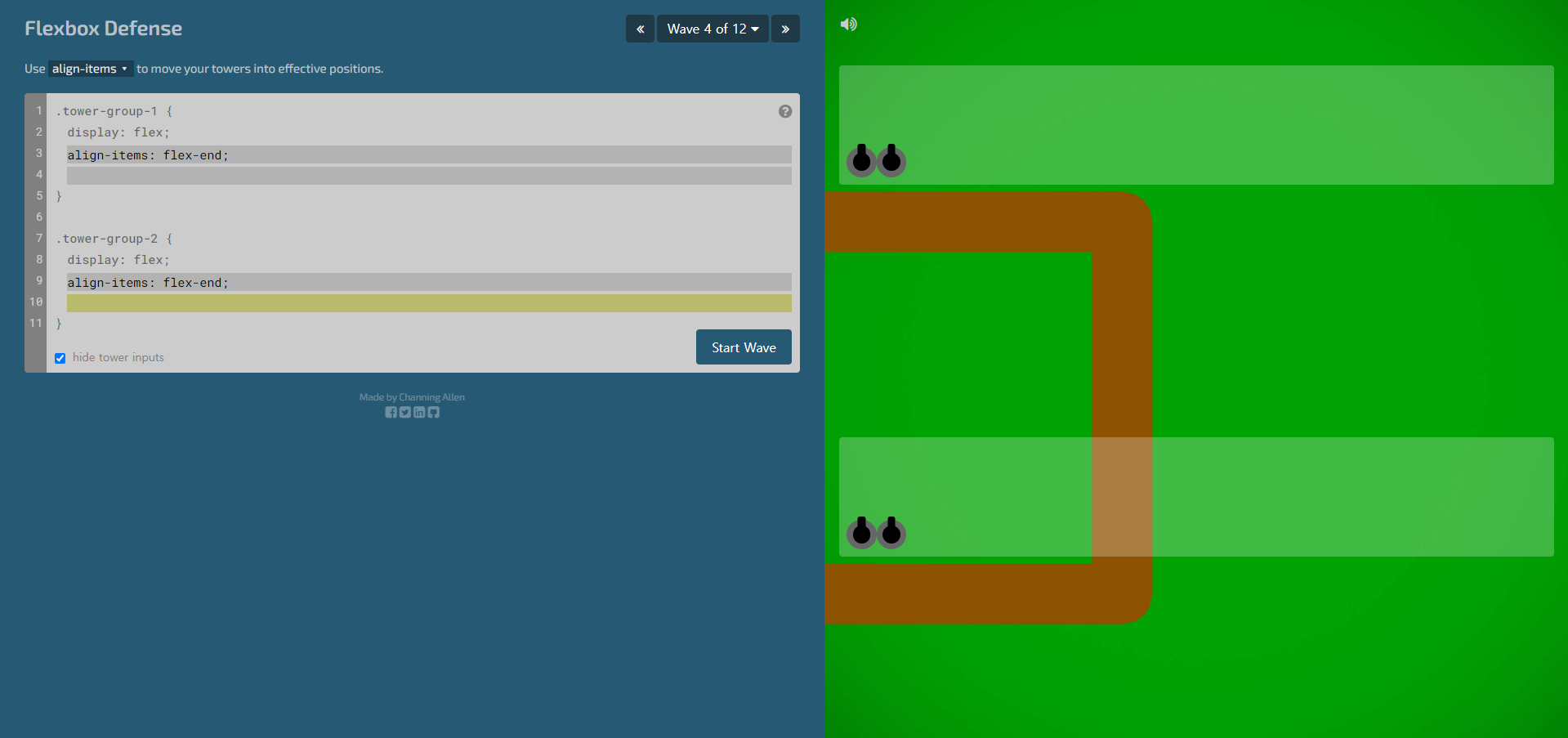
4단계
.tower-group-1 {
	display: flex;
	align-items: flex-end;
}
.tower-group-2 {
	display: flex;
	align-items: flex-end;
}
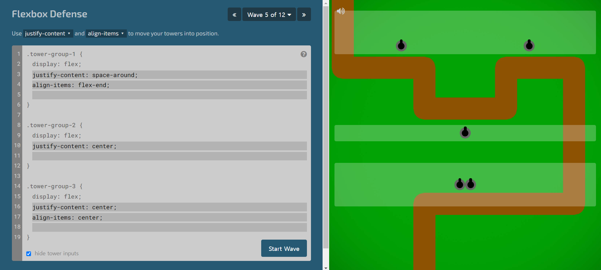
5단계
.tower-group-1 {
	display: flex;
	justify-content: space-around;
	align-items: flex-end;
}
.tower-group-2 {
	display: flex;
	justify-content: center;
}
.tower-group-3 {
	display: flex;
	justify-content: center;
	align-items: center;
}
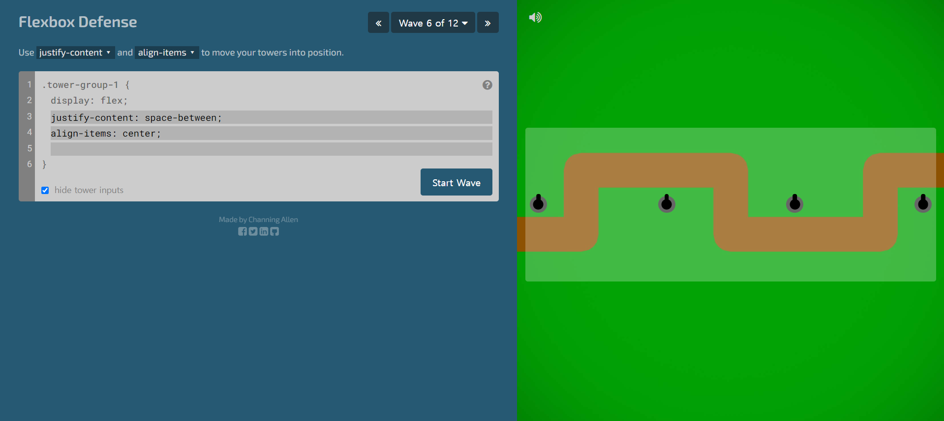
6단계
.tower-group-1 {
	display: flex;
	justify-content: space-between;
	align-items: center;
}
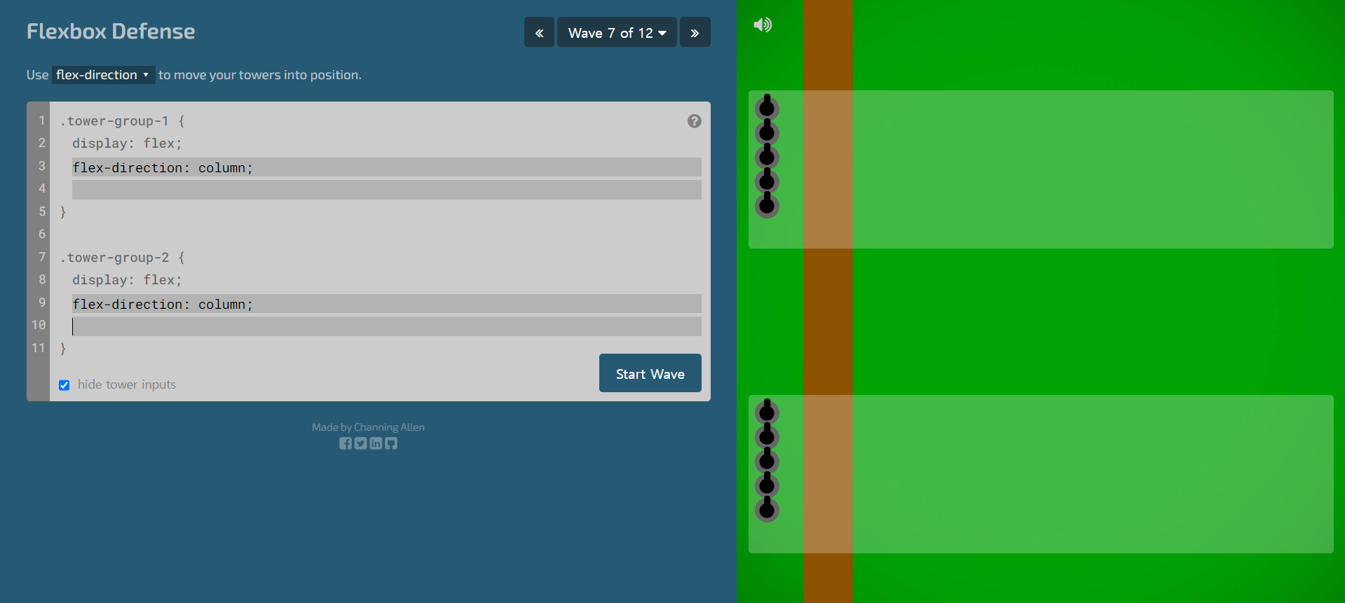
7단계
.tower-group-1 {
	display: flex;
	flex-direction: column;
}
.tower-group-2 {
	display: flex;
	flex-direction: column;
}
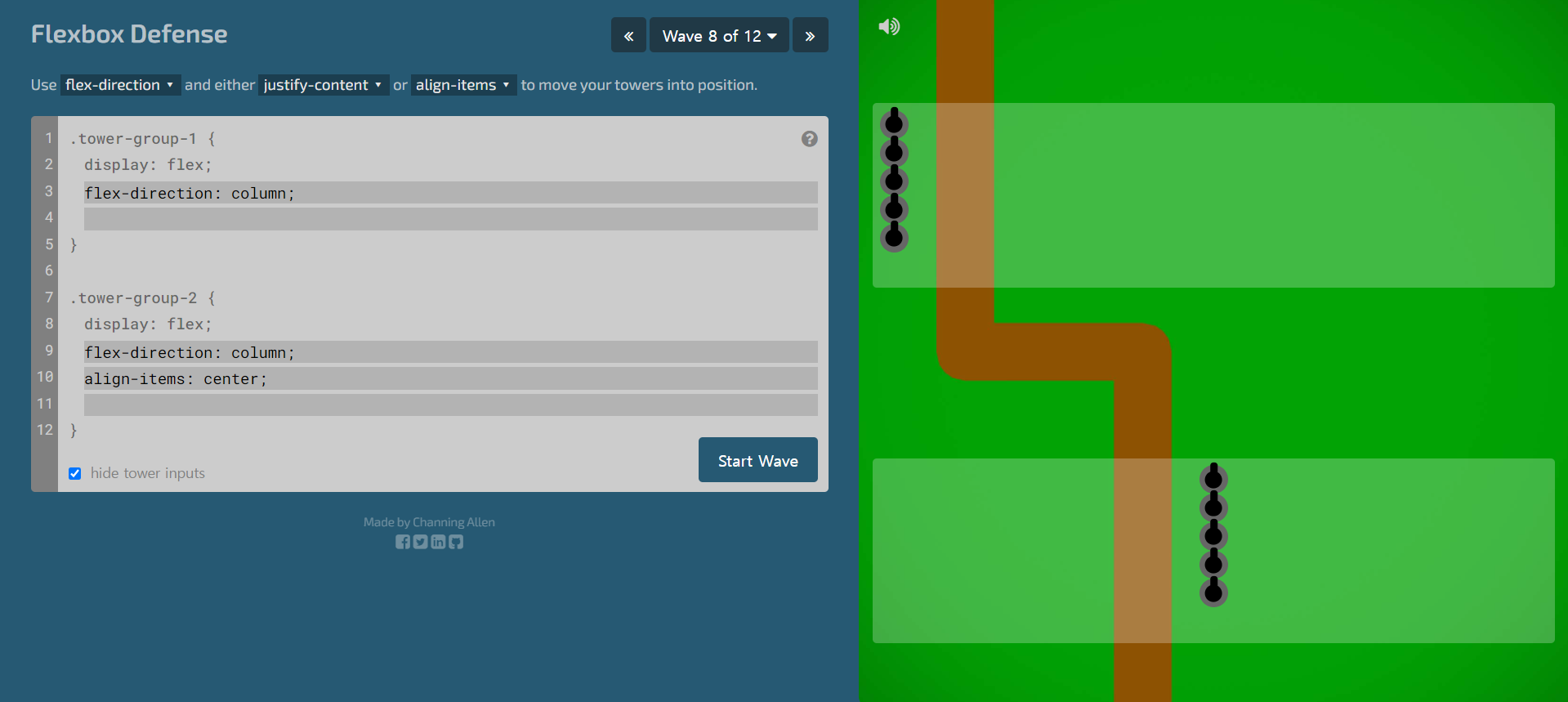
8단계
.tower-group-1 {
	display: flex;
	flex-direction: column;
}
.tower-group-2 {
	display: flex;
	flex-direction: column;
	align-items: center;
}
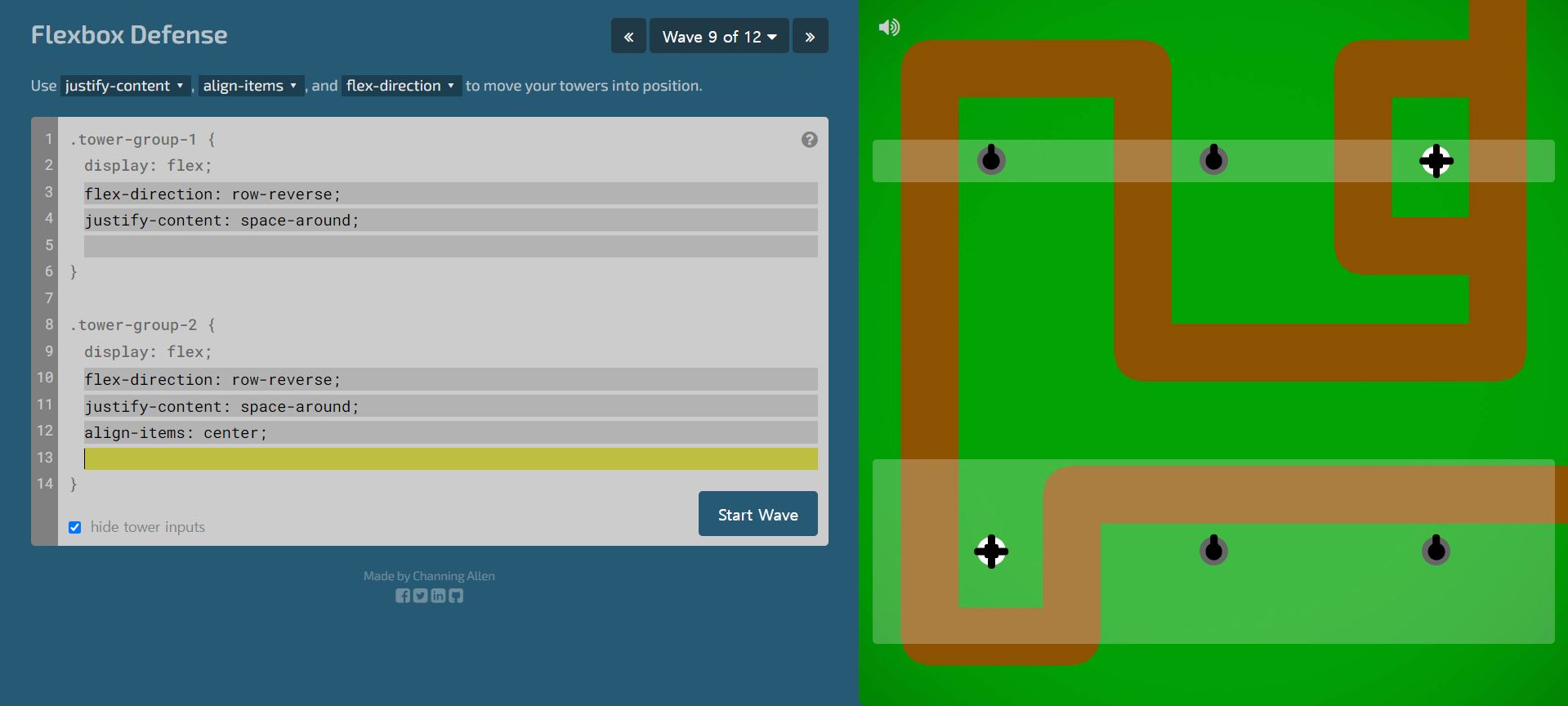
9단계
.tower-group-1 {
	display: flex;
	flex-direction: row-reverse;
	justify-content: space-around;
}
.tower-group-2 {
	display: flex;
	flex-direction: row-reverse;
	justify-content: space-around;
	align-items: center;
}
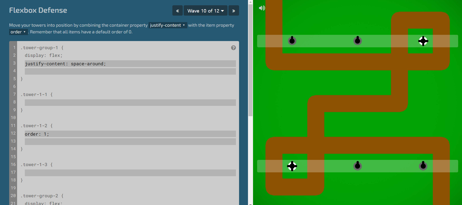
10단계
.tower-group-1 {
	display: flex;
	justify-content: space-around;
}
.tower-1-2 {
	order: 1;
}
.tower-group-2 {
	display: flex;
	justify-content: space-around;
}
.tower-2-2 {
	order: -1;
}
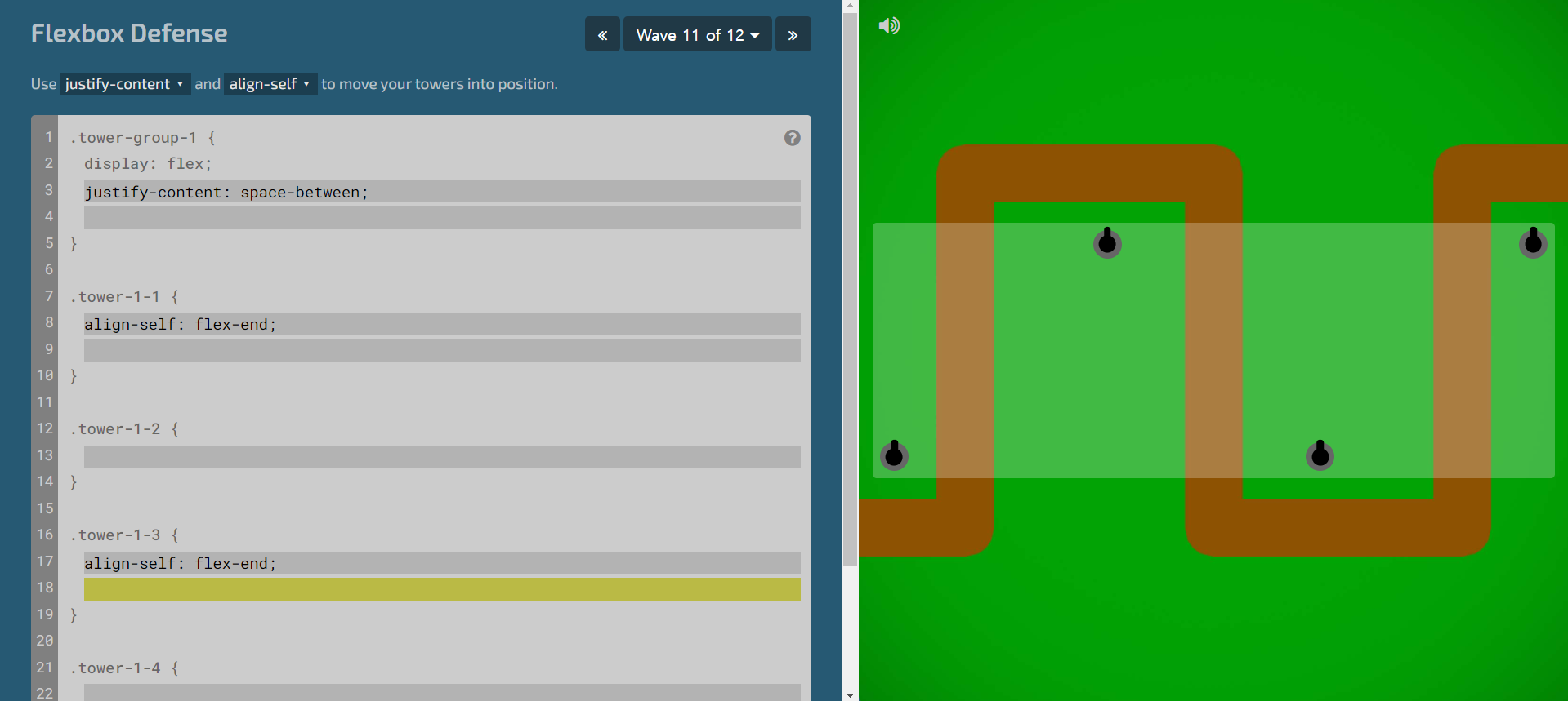
11단계
.tower-group-1 {
	display: flex;
	justify-content: space-between;
}
.tower-1-1 {
	align-self: flex-end;
}
.tower-1-3 {
	align-self: flex-end;
}
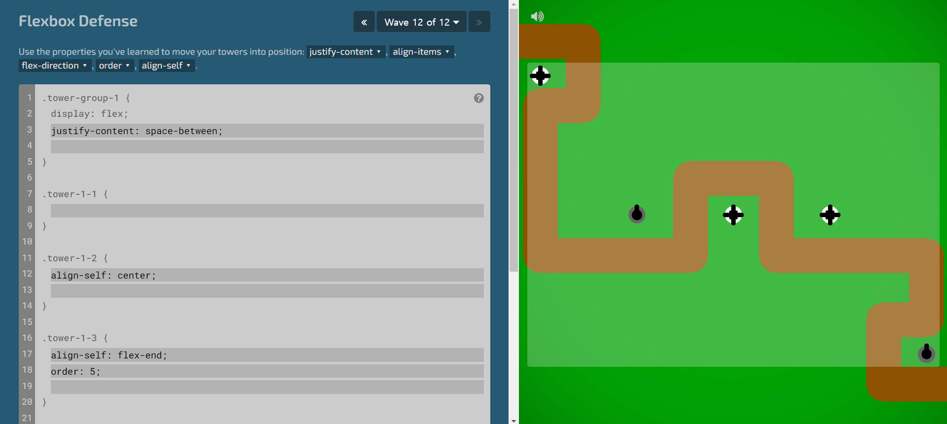
12단계
12단계에서 시간이 오래 걸렸던 이유는, tower-group-1에 align-content: space-between;을 적용하려고 했기 때문이다.
flex 개구리의 여파때문인지, 줄바꿈이 있는 경우의 정렬 상태를 바꿔주는데 사용했던 align-content를 사용하려고 했다. 12단계는 줄바꿈이 없기때문에 세로로 space-between의 속성값이 적용될리 없었다...
해답1. 가로로 요소의 간격을 justify-content로 모두 벌려놓기2. 세번째 요소와 다섯 번째 요소의 위치를 order로 바꾸기3. 세로의 중간과 끝에 위치할 요소를 각각 align-self로 설정하기
.tower-group-1 {
	display: flex;
	justify-content: space-between;
}
.tower-1-2 {
	align-self: center;
}
.tower-1-3 {
	order: 5;
	align-self: flex-end;
}
.tower-1-4 {
	align-self: center;
}
.tower-1-5 {
	order: 3;
	align-self: center;
}